Fujitsu
Internship
Over the course of a 6 month period I utilized the existing branding and pushed the boundaries of the companies design by creating new social media designs, powerpoint slides, booth designs, and icons.
-

Powerpoint design
The prompt was to provide an info-graphic of the S3 product line that can be utilized as both a future social media post and as a slide in a Fujitsu PowerPoint. I created the icons to the left as well as updated the main image to reflect the new font they had created as well as our main color: red and pink.
-

Icons
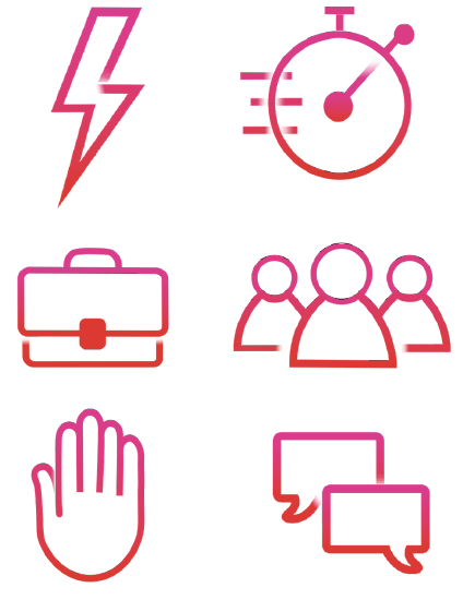
“Fujitsified” icons I had made for future applications. Using their hallmark design of fading in and out at intersections. These icons represent some of their products such as the Verso, QSS, and Bolt. They are currently being used on the company’s Datasheets.
-

Powerpoint design
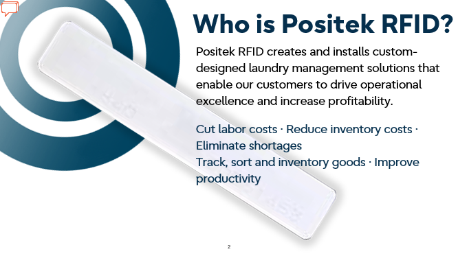
An example of a PowerPoint slide I created within the theme of a separate business venture my company owns. They have a completely different design aesthetic from the original company’s primary colors and had limited design assets for me to work with. The goal of this PowerPoint and the specific slide was to highlight their main product to new clients of which I added new assets for their future use such as the circle motif while using the company’s font to create some unity.

Design Mockup of Booth for EuroShop
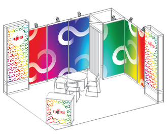
Original mockup of the booth design with the company’s trademark colors and infinity symbol. I wanted to include all of our colors as previous designs were one color or neutral and I wanted to take a chance and branch out. The colorful design would also better set off the black and white products they are showcasing as well as attract more customers.
Final Design at EuroShop
Photo of my design at the EuroShop Convention. The rainbow design on the light boxes was deemed too colorful with the rest of it and hence the design was adjusted accordingly.


